Toronto's Income Distribution

Toronto's Income Distribution
Information Design, 2016

PROJECT
January - February 2017
TIMEFRAME
Information Design / Data Visualization
TOOLS
Adobe Illustrator + InDesign
The Problem
Income distribution trends among Toronto neighbourhoods show a disturbing pattern of rising income inequality and division between wealthy and the poor neighbourhoods, with middle class neighbourhoods disappearing. This trend has come about over the past forty years, with three major income classes classified as ‘Toronto’s three cities’ to reflect the unique infrastructure and socio-economic attributes of each class. During the 1980’s, middle-class neighbourhoods prevailed over lower and wealthier neighbourhoods as compared the current year where poorer neighbourhoods make up 48% of Toronto and middle class neighbourhoods only 28%. This sudden shift in income inequality over the past four decades has serious consequences for Toronto residents such as higher rates of violence and mental health, inaccessibility to essential services, higher unemployment rates and unstable economies.
Final Design
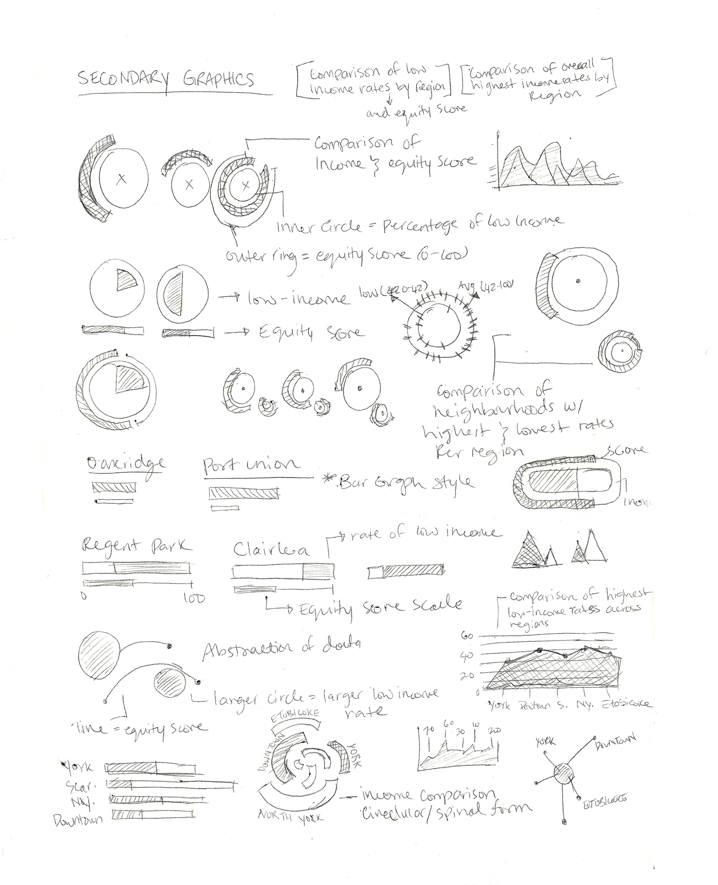
11 x 17" poster illustrating the income distrubtion across neighbourhoods in the four regions of Toronto and the corresponding Neighbourhood Equity Score.


